The Engagement Project
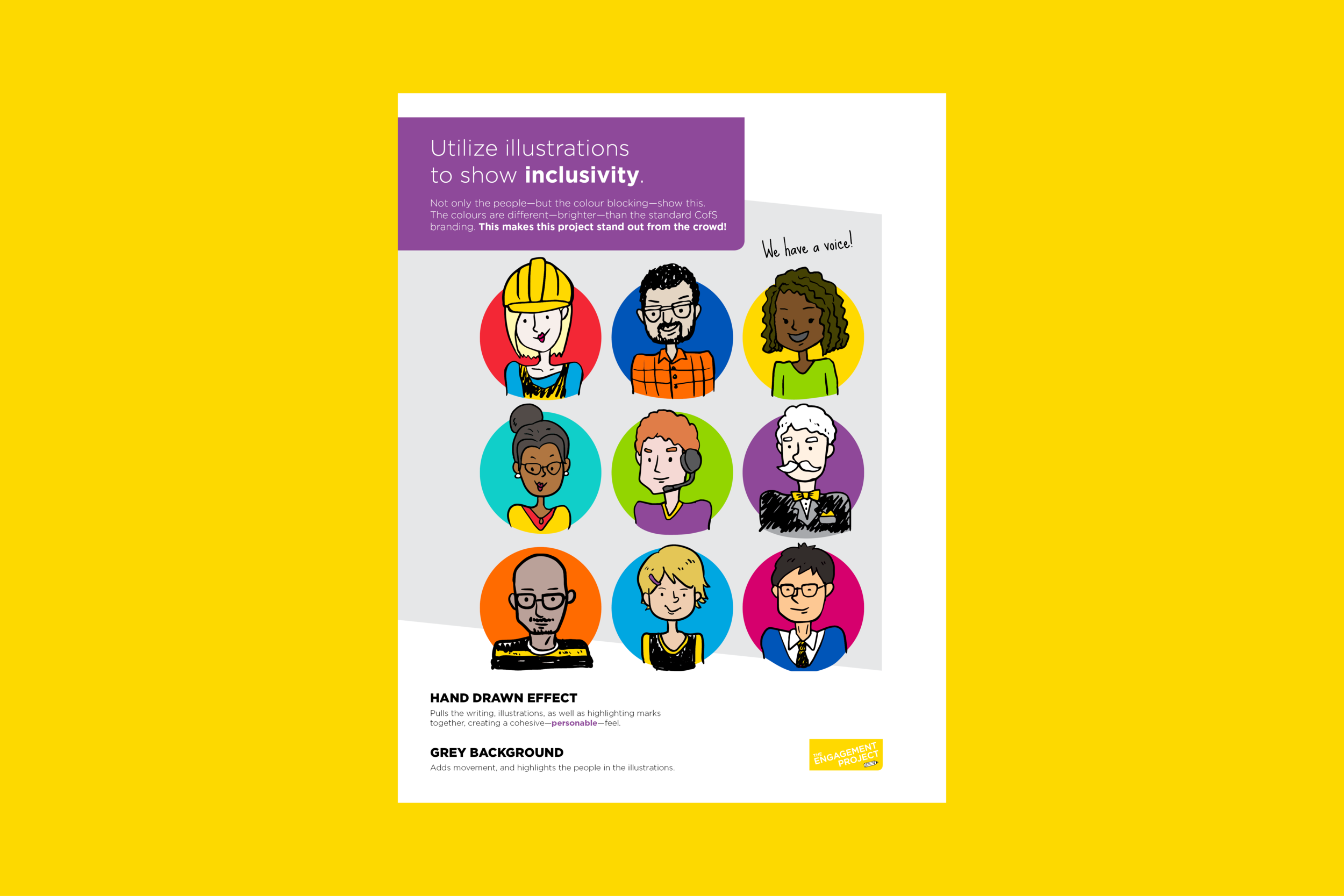
The City of Saskatoon has very strict brand guidelines to ensure a consistent tone and message. These guidelines can be pushed further on some campaigns, like the (internal) corporate initiative The Engagement Project. As it was directed to employees, I wanted it to have a relaxed, conversational tone. Hand-drawn illustrations and doodles helped portray the desired tone.

Employee Engagement Co-Design Session posters
Illustrations were utilized to show inclusivity. Not only the people - but the colour blocking - show this.

Engagement Innovation Co-Design Session poster
Hand-drawn effect pulls the writing, illustrations, as well as highlighting marks together, creating a cohesive - personable - feel.

Pulse Survey tent card
The elements flow from one side to the next - showing everything is linked - just like the inclusive nature of this project!

Pulse Survey poster
The grey background used through all materials adds movement, and highlights the people in the illustrations.

First Quarter Corporate Update poster
The colours are different - brighter! - than the standard City of Saskatoon branding. This makes the project stand out from the crowd!

